

Color is what makes boho boho. Shop the Look You can put on a dress in the right cut and fabric, but if the palette is off the entire look loses its softness. The good news is that the boho palette is one of the most forgiving in fashion — almost all the colors agree with each other.
Here's how the palette breaks down, and how to mix from it confidently.
Earth tones: the foundation
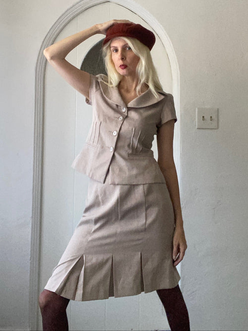
Earth tones are the boho heartland — cream, ivory, butter, ochre, mustard, rust, terracotta, cinnamon, chocolate, olive, sage, and dusty rose. Every other boho color decision works because these tones form a quiet, warm base.
Most outfits look stylish when two or three earth tones layer together — for example cream, rust, and olive — with no other color at all.
Rust and terracotta
Rust is the workhorse of the boho palette. It flatters most skin tones, pairs with denim, leather, gold, and turquoise, and reads warm without being heavy. Terracotta is its slightly more pink-orange cousin and shines especially in spring outfits.
A rust maxi is one of the most versatile pieces you can own.
Cream and ivory
Cream functions in boho the way black functions elsewhere — as a neutral. Cream lace, cream cotton, cream knit, cream linen — all of them anchor brighter pieces and let texture take the lead.
Cream against rust is one of the all-time-great boho color pairs.
Sage and olive
Greens in boho live in the soft, gray-greens and warm olive ranges, not in cool kelly green or emerald. Sage pairs especially well with cream and dusty rose; olive pairs beautifully with rust and chocolate.
These greens read calm and natural rather than punchy.
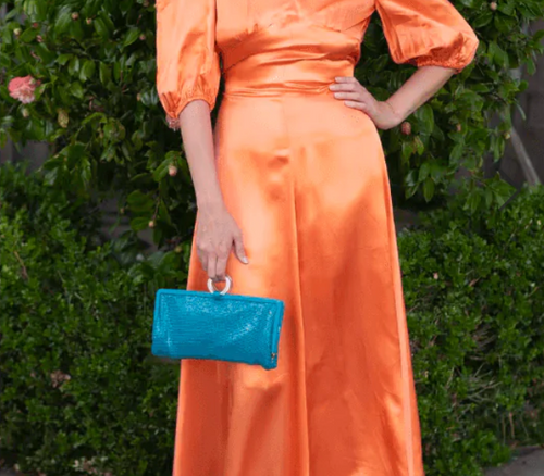
Deep teal as the accent
If you want one cool color in your boho palette, make it deep teal. It plays as an accent — a teal velvet ribbon, a teal stone, a teal embroidery thread — and gives the warm palette a place to breathe. True teal is dusky and slightly green, not bright peacock.
Use sparingly and the contrast will read intentional.
Building a palette from scratch
Pick three colors: one base (cream, ivory, butter, or chocolate), one statement (rust, mustard, sage, or terracotta), and one accent (turquoise, teal, dusty rose, or oxblood). Use the base for 50% of the outfit, the statement for 35%, and the accent for 15%. The math sounds rigid, but in practice it produces effortless-looking outfits.
Try it once and you'll see how quickly outfits start cohering.
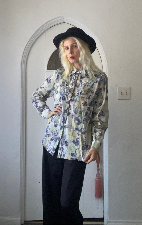
Prints in the boho palette
Floral, paisley, calico, ditsy, and folk prints all live happily in this palette. The trick is to check the print's background tone — if it's cream, butter, rust, or chocolate, it'll integrate beautifully. If it's pure white or stark black, it tends to feel like a different style entirely.


